Requirements
- Image Hopper 2.0.0+
The plugin cannot be used without Image Hopper Core (view the Core requirements).
Installation
After completing the checkout process for any of the standard license packages you will be redirected to the Purchase Confirmation page. Here you will be able to download Image Hopper Core and the Editor plugin zip files. Both plugins need to be installed and activated to use the Editor functionality.

Follow the Core installation process, and then repeat the steps to install and activate the Editor add-on too.
License Registration
The Editor add-on shares the Image Hopper Core license key, and you can register both plugins using the same license key in one convenient location.
Image Hopper Field

The Editor add-on extends the capabilities of the Image Hopper field available in Core. You can find the Image Hopper field in the Advanced Fields section of the Gravity Forms Editor.
With the Editor functionality enabled, users will be able to edit their images in the following ways:
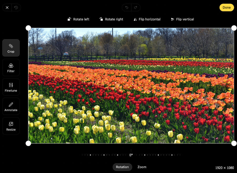
- Crop, rotate, flip, and zoom
- Apply image filters such as Monochrome or Sepia
- Adjust brightness, contrast, saturation, exposure, temperature, gamma, clarity, vignette
- Annotate or markup the image using lines, arrows, rectangle, ellipse, text, path, or pen tools
- Resize
- Redact confidential information or sensitive content that are visible on the image
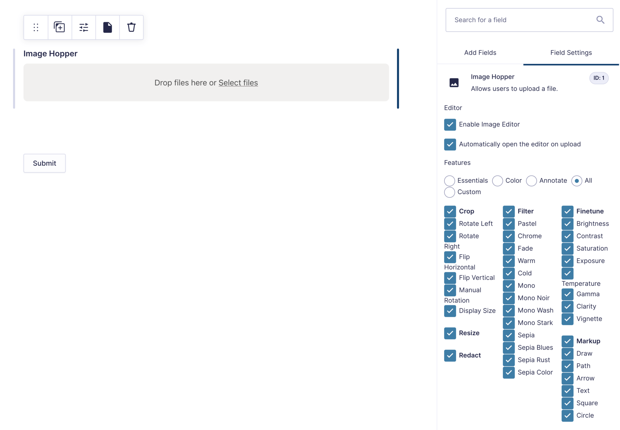
Field Settings
The following settings are included in the Image Hopper field when the Editor add-on is installed and activated on your WordPress website:
Enable Image Editor
When enabled, it converts the Image Hopper field from a smart uploader to a smart image editor.
Open Editor on Upload
When enabled, for every image uploaded the Image Editor will automatically open so the user can make appropriate adjustments. If it’s disabled, a user can click the edit icon on an image to manually open the editor. This option is best used when a small number of images are to be uploaded (works well with the Maximum Number of Files feature).

Features
You have total control over what image editing capabilities you want to give users, and this allows Image Hopper to be easily used for a variety of use cases. We’ve even included a number of helpful presets to get you started fast (but you don’t have to use them and can pick and choose the features you need).
Available Presets:
- Essentials – enables the crop and rotate features.
- Color – enables a selection of filters and finetune features
- Annotate – enables the draw, arrow, and text markup features, as well as crop, manual rotation, and redact feature
- All – enable every image editing feature
Available Features
Below is the full list of features that you can enable or disable in the Image Editor:
- Crop – crop an image to a specific size
- Rotate Left – rotates the image 90 degrees counterclockwise.
- Rotate Right – rotates the image 90 degrees clockwise.
- Flip Horizontal – flips the image 180 degrees on the X axis.
- Flip Vertical – flips the image 180 degrees on the Y axis.
- Manual Rotation – allows the image rotation to be adjusted up to -45 degrees or +45 degrees.
- Display Size – shows the current size the image will be cropped to

- Filter – apply a photo effect to the image using one of the 13 available filters
- Pastel
- Chrome
- Fade
- Warm
- Cold
- Mono
- Mono Noir
- Mono Wash
- Mono Stark
- Sepia
- Sepia Blues
- Sepia Rust
- Sepia Color

- Finetune – control the brightness, contrast, saturation, exposure, temperature, gamma, clarity, and vignette
- Markup – annotate, draw, and write notes on the image. To move shapes or objects within the Editor, hold down the shift key on the keyboard, and click on each one individually to reposition.
- Draw – free-hand drawing. The color and thickness of the line can be modified to be user.
- Line – draw a line. The color, thickness, and line ends (to add indicators or arrows) can be modified to be user.
- Arrow – draw an arrow. The color, thickness, and line ends (to add indicators or arrows) can be modified to be user.
- Text – add text to the image. Single-line text can be added by clicking or tapping anywhere on the image. Multi-line text can be added by dragging a box on the image. The font, size, and color are adjustable.
- Square – draw a solid or stroked square onto the image, controlling the color and line thickness.
- Circle – draw a solid or stroked circle onto the image, controlling the color and line thickness.
- Path – draw multiple lines together to make a path or shape. The line color, line thickness, and fill color can all be modified by the user.

- Resize – allows the user to downscale or upscale the image dimensions at will. The image is locked to the aspect ratio by default, but the user can disable it.
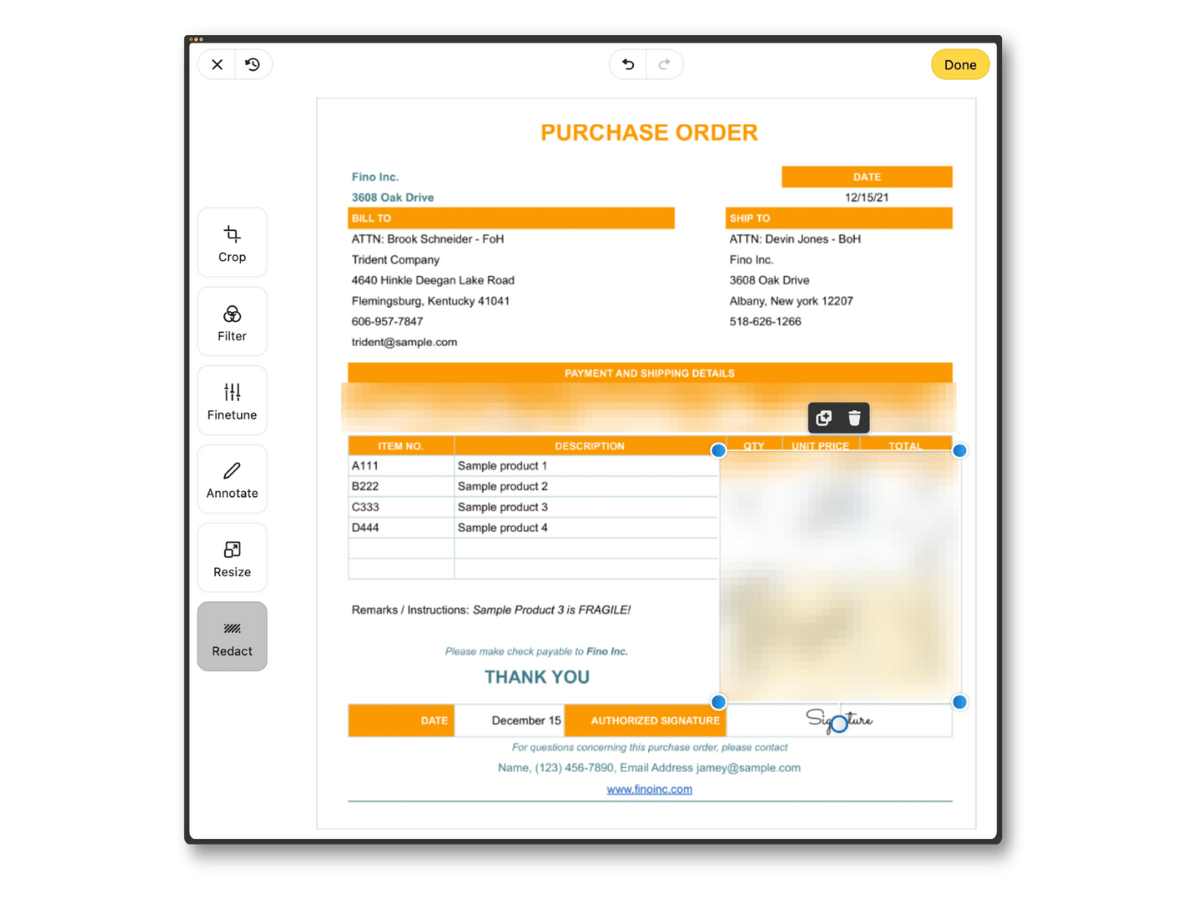
- Redact – remove confidential information or sensitive parts that are visible on the image.
Appearance Settings
Editor Appearance
This setting is available in the Appearance section of the Image Hopper field in the Form Editor. It has three options which control how the image editor will be displayed to the user when opened:
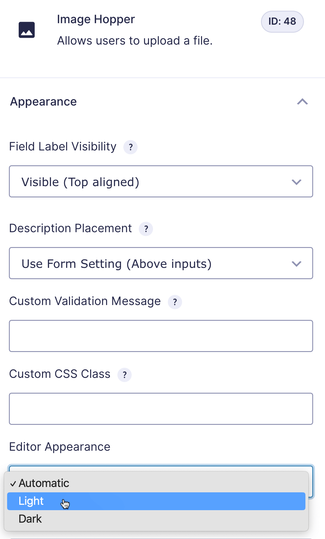
- Automatic – the browser/device settings will determine if the light or dark appearance is shown
- Light – the editor background color will be white and the text black
- Dark – the editor background color will be black and the text white
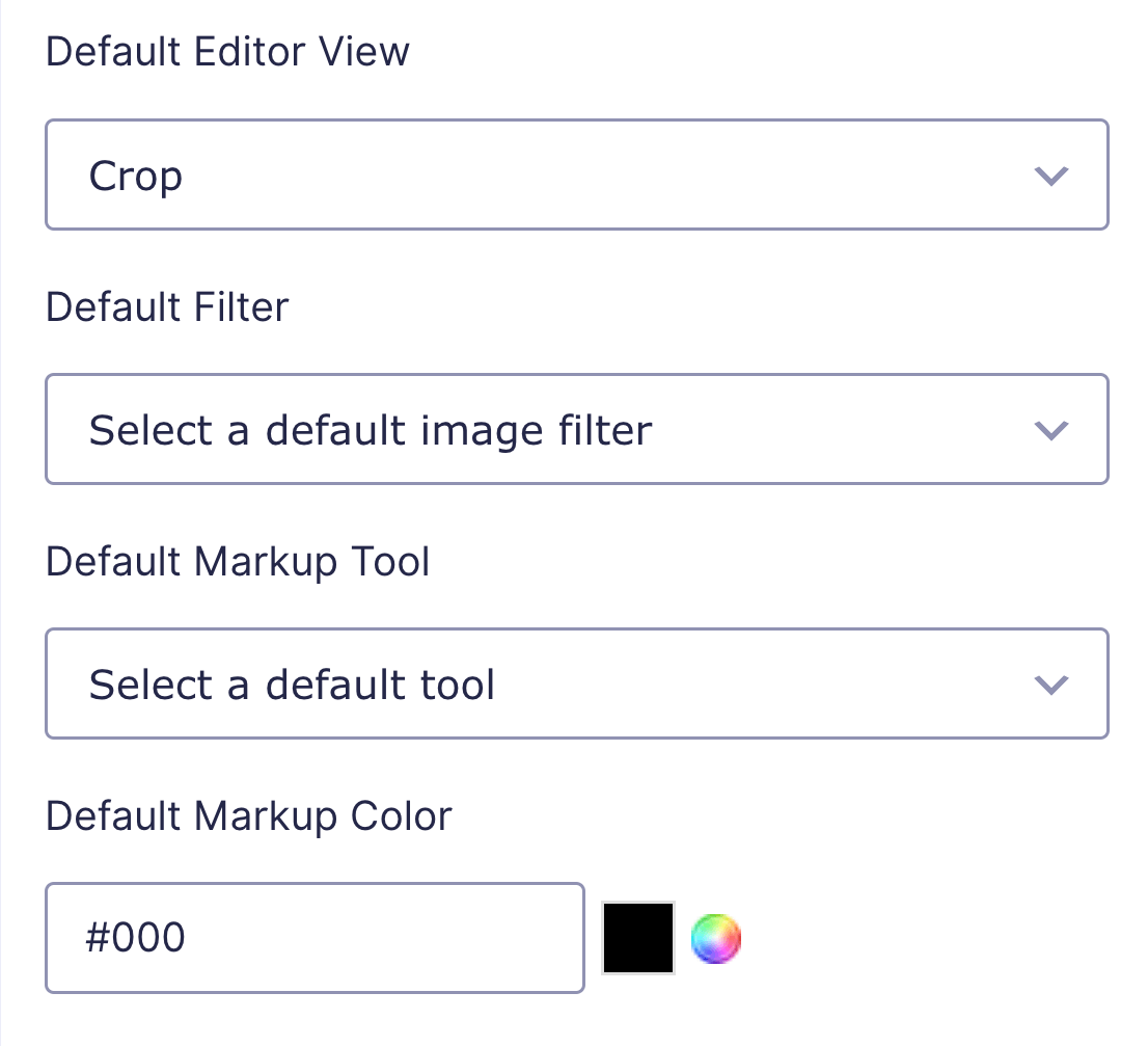
Default Editor View
When the Image Editor is first open, this determines which of the primary setting tabs will be displayed by default: Crop, Filter, Color, Markup, Resize, or Redact. If a primary setting is disabled in Features it will be automatically hidden as an option.
If you use a preset, this setting is automatically adjusted to the relevant option (but you can override it):
- Essentials -> Crop
- Color -> Filter
- Annotate -> Markup
- All -> Crop
Default Filter
Automatically apply a filter to the uploaded image. This setting can be used with or without the Image Editor enabled.
Default Markup Tool
Select a markup tool that will automatically be selected when the user clicks on the Annotate tab.
Default Markup Color
Select a color that will automatically be applied to the default markup tool. The default color is black (#000).
Editing an Entry
On the Entry Details page, you can view any image/s uploaded when a form is submitted using the Image Hopper field. From there, you can Edit an entry and adjust the image using any Image Hopper Editor tools that you’ve made available.

Browser Support
The editor has the same browser support as Image Hopper core.
Translations
Image Hopper ships with the following translations out of the box:
- English (en_US)
- French (fr_FR)
- Spanish (es_ES)
- German (de_DE)
If you’d like your language to be supported natively, please get in touch and let us know. The more demand for a specific language the greater the chance of it getting added.
Self-Translation
You can use the free Loco Translate plugin to write your own translations specifically for Image Hopper Editor. The Gravity PDF team have an excellent guide which shows you how to go about translating a plugin. Just substitute Gravity PDF for Image Hopper Editor when completing the steps.
If you prefer to generate a PO/MO file for your chosen language using a tool like POEdit, you can find the POT language file at /languages/image-hopper-editor.pot in the plugin zip file.
Upgrade from v1 to v2
The v2 upgrade overhauls the editor experience and changes the way users interact with the image editor. The new UI has additional features like undo/redo, multiline annotations, and Light/Dark mode, is more accessible, and displays better on mobile and tablet devices.
Refer to the video below for a brief overview of the changes:
After upgrading and testing out the new UI you might find you enjoyed some aspects of the v1 interface better. Below are a couple of minor tweaks you can make to get a closer experience:
- There is a new Appearance setting added to the Image Hopper field when you have the editor enabled that allows you to toggle Light or Dark modes. If you have a lot of Image Hopper fields it may be cumbersome to update each one individually. For a catch-all solution you can add the following code to your Customizer Additional CSS section:
.pintura-editor {
   --color-background: 0,0,0;
   --color-foreground: 255,255,255;
}- The new UI will make full use of the browser window when rendering and for users with wide monitors this leave the UI controls spaced widely apart. If you prefer a narrower, condensed, UI you can add a HTML field to each form that includes an Image Hopper field and include the following code snippet:
<script>
gform.addFilter('image_hopper_filepond_config', function(config, FilePond, $form, currentPage, formId, fieldId, entryId, files, inputField) {
   config.imageEditor.editorOptions.layoutDirectionPreference = 'vertical';
   return config
}, 20, 9 )
</script>
If you made use of self-translations for Image Hopper you will need to review the new/modified strings accordingly. The French, Spanish, and German strings natively supported have already been updated.
If you implemented one of the Javascript actions/filters you will need to adjust this code to use the new properties available in the Pintura editor (previously Doka). You now set these properties through config.imageEditor.editorOptions. Refer to the updated examples in the Developer Javascript section which are v2-compatible.
Finally, Internet Explorer 11 support has been removed and the modern browser versions that are supported have been bumped up slightly. Refer to the browser support list to see what’s covered.
Developers
Below is useful actions/filters that can be used to change how Image Hopper functions:
Javascript Actions/Filters
image_hopper_filepond_config(config, FilePond, $form, currentPage, formId, fieldId, entryId, files, fileInput)
This filter allows you to manipulate the FilePond instance configuration, and when the Image Editor is enabled config.imageEditEditor is made available and holds the Pintura instance, allowing you to adjust its properties on demand.
config {object} – The FilePond configuration object, which accepts all the properties listed in the FilePond instance documentation. The config.imageEditEditor object will accept any of the properties listed in the Pintura instance documentation.FilePond {object} – The FilePond public API object. $form {object} – A jQuery object matching the encompassing Gravity Forms <form> element currentPage {int} – The current page number of the Gravity Forms form. formId {int} – The Gravity Forms form ID fieldId {int} – The Image Hopper field ID entryId {int} – The Gravity Forms entry ID (if one exists) files {array} – A list of the files already uploaded at the time of initialisation fileInput {object} – The <input type="file"> object currently being Image Hopper’d
Examples
Set an image aspect ratio of 1:1 for all uploaded images (rather than a fixed size, which is how the Downscale Image setting works):
gform.addFilter('image_hopper_filepond_config', function(config, FilePond, $form, currentPage, formId, fieldId, entryId, files, inputField) {
   config.imageEditor.editorOptions.imageCropAspectRatio = 1;
   return config
}, 20, 9 )
Add multiple aspect ratio options which the user can select in the Crop primary setting:
gform.addFilter('image_hopper_filepond_config', function(config, FilePond, $form, currentPage, formId, fieldId, entryId, files, inputField) {
   config.imageEditor.editorOptions.cropEnableSelectPreset = true
   config.imageEditor.editorOptions.cropSelectPresetOptions = [
        [undefined, 'Free'],
        [1, 'Square'],
        [4 / 3, 'Landscape'],
        [3 / 4, 'Portrait'],
    ]
   return config
}, 20, 9 )
Allow users to crop outside the image boundary, with a white background used to fill the extra space:
gform.addFilter('image_hopper_filepond_config', function(config, FilePond, $form, currentPage, formId, fieldId, entryId, files, inputField) {
    config.imageEditor.editorOptions.imageCropLimitToImage = false
    config.imageEditor.editorOptions.imageBackgroundColor = [255, 255, 255]

   return config
}, 20 )
This snippet will change the image preview height to 200px:
gform.addFilter('image_hopper_filepond_config', function(config, FilePond, $form, currentPage, formId, fieldId, entryId, files, inputField) {
   config.styleItemPanelAspectRatio = null
   config.filePosterHeight = 200

   return config
}, 20 )
Add a “stickers” feature, which allows emojis, custom text, or images to be overlaid onto the image:
gform.addFilter('image_hopper_filepond_config', function(config, FilePond, $form, currentPage, formId, fieldId, entryId, files, inputField) {
   config.imageEditor.editorOptions.stickers = ['🎉', '😄', '👍', '👎', '🍕']
   config.imageEditor.editorOptions.utils.push('sticker')
   return config
}, 20 )
You can use any of the standard emojis as stickers. You can also define your own SVG images.
In Image Hopper Editor 2.1 you can enable a “frame” feature to allow users to add a unique border to the images:
gform.addFilter('image_hopper_filepond_config', function(config, FilePond, $form, currentPage, formId, fieldId, entryId, files, inputField) {
   config.imageEditor.editorOptions.utils.push('frame')
   return config
}, 20 )
You can also add a circular crop overlay to help your users get the best image crop. This is useful if you plan to display images with border-radius: 50%:
gform.addFilter('image_hopper_filepond_config', function(config, FilePond, $form, currentPage, formId, fieldId, entryId, files, inputField) {

config.imageEditor.editorOptions.willRenderCanvas = function(shapes, state) {
        const {
            utilVisibility,
            selectionRect,
            lineColor,
            backgroundColor,
        } = state;

        // Exit if crop utils is not visible
        if (utilVisibility.crop <= 0) return shapes;

        // Get variable shortcuts to the crop selection rect
        const { x, y, width, height } = selectionRect;

        return {
            // Copy all props from current shapes
            ...shapes,

            // Now we add an inverted ellipse shape to the interface shapes array
            interfaceShapes: [
                {
                    x: x + width * 0.5,
                    y: y + height * 0.5,
                    rx: width * 0.5,
                    ry: height * 0.5,
                    opacity: utilVisibility.crop,
                    inverted: true,
                    backgroundColor: [...backgroundColor, 0.5],
                    strokeWidth: 1,
                    strokeColor: [...lineColor],
                },
                // Spread all existing interface shapes onto the array
                ...shapes.interfaceShapes,
            ],
        }
    }

   return config
}, 20 )
If you want to apply the circular mask to the image upon saving so you don’t need to bother with border-radius, you can use this code snippet instead:
gform.addFilter('image_hopper_filepond_config', function (config, FilePond, $form, currentPage, formId, fieldId, entryId, files, inputField) {

    config.imageEditor.editorOptions.willRenderCanvas = function(shapes, state) {
        const {
            utilVisibility,
            selectionRect,
            lineColor,
            backgroundColor,
        } = state;

        // Exit if crop utils is not visible
        if (utilVisibility.crop <= 0) return shapes;

        // Get variable shortcuts to the crop selection rect
        const { x, y, width, height } = selectionRect;

        return {
            // Copy all props from current shapes
            ...shapes,

            // Now we add an inverted ellipse shape to the interface shapes array
            interfaceShapes: [
                {
                    x: x + width * 0.5,
                    y: y + height * 0.5,
                    rx: width * 0.5,
                    ry: height * 0.5,
                    opacity: utilVisibility.crop,
                    inverted: true,
                    backgroundColor: [...backgroundColor, 0.5],
                    strokeWidth: 1,
                    strokeColor: [...lineColor],
                },
                // Spread all existing interface shapes onto the array
                ...shapes.interfaceShapes,
            ],
        }
    }

  config.imageEditor.imageWriter[1].postprocessImageData = (imageData) =>
        new Promise((resolve) => {
            // Create a canvas element to handle the imageData
            const canvas = document.createElement('canvas');
            canvas.width = imageData.width;
            canvas.height = imageData.height;
            const ctx = canvas.getContext('2d');
            ctx.putImageData(imageData, 0, 0);

            // Only draw image where we render our circular mask
            ctx.globalCompositeOperation = 'destination-in';

            // Draw our circular mask
            ctx.fillStyle = 'black';
            ctx.beginPath();
            ctx.arc(
                imageData.width * 0.5,
                imageData.height * 0.5,
                imageData.width * 0.5,
                0,
                2 * Math.PI
            );
            ctx.fill();

            // Returns the modified imageData
            resolve(
                ctx.getImageData(0, 0, canvas.width, canvas.height)
            );
    })

  return config
}, 20)
If you want to set specific details for the annotate editor view, you can use the following:
gform.addFilter('image_hopper_filepond_config', function(config, FilePond, $form, currentPage, formId, fieldId, entryId, files, inputField) {

// Set the default active tool on the annotate screen to "text". Available options include: eraser, sharpie, line, arrow, text, rectangle, ellipse
config.imageEditor.editorOptions.annotateActiveTool = 'text'

// Change the text tool defaults
config.imageEditor.editorOptions.markupEditorToolStyles.text[0].color = [0,0,0] // This array is RGB color value that has each integer divided by 256 so that each number is between 0 and 1. i.e grey = [128/256, 128/256, 128/256]

config.imageEditor.editorOptions.markupEditorToolStyles.text[0].fontSize = '15%' // Extra small = 2%, Small = 4%, Medium Small = 8%, Medium = 10%, Medium Large = 15%, Large = 20%, Extra Large = 25%

// Use your own custom font list. Note: you must load the font in the browser (like you would any other web font) or the user must have it installed locally for the font to be displayed correctly
config.imageEditor.editorOptions.markupEditorShapeStyleControls.fontFamily[1].options = [
   [undefined, 'Default'],
   ['arial', 'Arial'],
   ['avenir', 'Avenir'],
   ['courier', 'Courier'],
]

   return config
}, 20 )
To add a text watermark to uploaded images automatically you can use the following (update the watermarkText const and styles to suit):
gform.addFilter('image_hopper_filepond_config', function (config, FilePond, $form, currentPage, formId, fieldId, entryId, files, inputField) {
  config.imageEditor.imageWriter[1].postprocessImageData = (imageData) =>
    new Promise((resolve, reject) => {
      // Create a canvas element to handle the imageData
      const canvas = document.createElement('canvas')
      canvas.width = imageData.width
      canvas.height = imageData.height
      const ctx = canvas.getContext('2d')
      ctx.putImageData(imageData, 0, 0)

      // Draw our watermark on top
      ctx.font = '40px sans-serif'
      ctx.fillStyle = '#ffffff'
      const watermarkText = 'Image Hopper'
      const textLength = ctx.measureText(watermarkText)
      ctx.fillText(
        watermarkText,
        imageData.width - textLength.width - 30,
        imageData.height - 30
      )

      // Get and return the modified imageData
      resolve(
        ctx.getImageData(
          0,
          0,
          imageData.width,
          imageData.height
        )
      )
    })

  return config
}, 20)
To add an image watermark to uploaded images automatically you can use the following (update the URL to point to a media library image on your server and adjust the width/height to suit):
gform.addFilter('image_hopper_filepond_config', function (config, FilePond, $form, currentPage, formId, fieldId, entryId, files, inputField) {
  config.imageEditor.imageWriter[1].postprocessImageData = (imageData) =>
    new Promise((resolve, reject) => {
      // Create a canvas element to handle the imageData
      const canvas = document.createElement('canvas')
      canvas.width = imageData.width
      canvas.height = imageData.height
      const ctx = canvas.getContext('2d')
      ctx.putImageData(imageData, 0, 0)

      // Draw our watermark on top
      const watermark = new Image()
      watermark.onload = () => {
        // how to draw the image to the canvas
        ctx.globalCompositeOperation = 'screen'

        // draw the watermark in the bottom right corner
        ctx.drawImage(
          watermark,

          // the watermark x and y position
          imageData.width - 100 - 20,
          imageData.height - 40 - 20,

          // the watermark width and height
          100,
          40
        )

        // Get and return the modified imageData
        resolve(
          ctx.getImageData(
            0,
            0,
            imageData.width,
            imageData.height
          )
        )
      }
      watermark.onerror = reject
      watermark.crossOrigin = 'Anonymous'
      watermark.src = 'https://imagehopper.tech/image/watermark.png'
    })

  return config
}, 20)
Usage
While you could create a separate JavaScript file and enqueue it when your desired Gravity Forms form is displayed, it’s far easier to add an HTML field to your form and wrap the filter in <script type="text/javascript"></script> tags.

Additional Info
You can manipulate any of the properties listed in the Pintura documentation. It’s also worth pointing out that Pintura is integrated directly into FilePond and most of the Pintura options are set through config.imageEditor.editorOptions.
PHP Actions/Filters
image_hopper_editor_file_path( $file_path, $url )
This filter allows you to adjust the reference URL for an image when updating an existing image that has been edited. It’s most useful when you change the Gravity Forms upload directory using the gform_upload_path filter.
$file_path {string} – The path of the image stored on the server$url {string} – The original URL of the image stored on the server
Examples
Use an alternate upload directory for the images:
/* Change the upload path */
add_filter( "gform_upload_path", function( $path_info, $form_id ) {
	$path_info["path"] = WP_CONTENT_DIR . "/uploads/Images/" . $form_id . "/";
	$path_info["url"]  = WP_CONTENT_URL . "/uploads/Images/" . $form_id . "/";

	return $path_info;
}, 10, 2 );

/* Ensure the new upload path is used when deleting files */
add_filter( 'gform_file_path_pre_delete_file', function( $file_path, $url ) {
	$wp_upload_dir = wp_upload_dir();
	$file_path     = str_replace( $wp_upload_dir['baseurl'], $wp_upload_dir['basedir'], $file_path );

	return $file_path;
}, 1, 2 );

/* Ensure the new upload path is used when overriding files when using the editor */
add_filter( 'image_hopper_editor_physical_file_path', function( $file_path, $url ) {
	$wp_upload_dir = wp_upload_dir();
	$file_path     = str_replace( $wp_upload_dir['baseurl'], $wp_upload_dir['basedir'], $file_path );

	return $file_path;
}, 10, 2 );
Usage
The standard place to include the snippet is in your active theme’s functions.php file.