
The Image Hopper Editor extends the capabilities of the Image Hopper field available in Core. You can find the Image Hopper field in the Advanced Fields section of the Gravity Forms Editor.
With the Editor functionality enabled, users can edit their images in comprehensive ways.

At a glance
- Crop, rotate, flip, and zoom images
- Apply 13 image filters (Sepia, Monochrome, Fade, and more)
- Fine-tune adjustments (brightness, contrast, saturation, exposure, temperature, gamma, clarity, vignette)
- Annotate and markup with lines, arrows, shapes, text, and freehand drawing
- Resize and downscale or upscale dimensions
- Redact sensitive information with the redaction tool
- Multiple feature presets to get started quickly
- Light and dark appearance modes
Available Editing Features
With the Editor functionality enabled, users can:
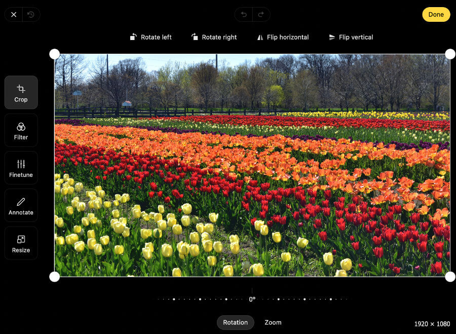
- Crop, rotate, flip, and zoom
- Apply image filters such as Monochrome or Sepia
- Adjust brightness, contrast, saturation, exposure, temperature, gamma, clarity, vignette
- Annotate or markup the image using lines, arrows, rectangle, ellipse, text, path, or pen tools
- Resize
- Redact confidential information or sensitive content that are visible on the image
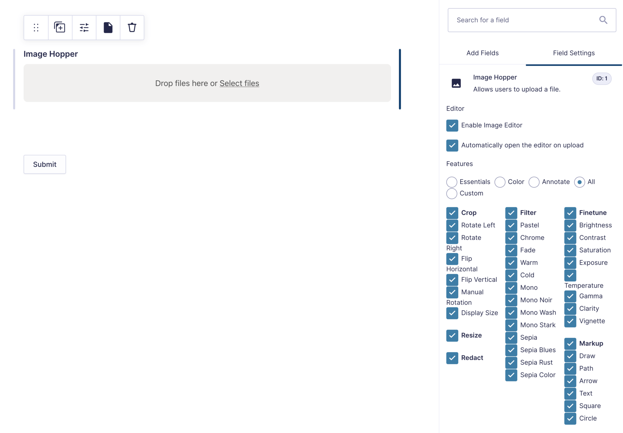
Field Settings
The following settings are included in the Image Hopper field when the Editor add-on is installed and activated on your WordPress website.
Enable Image Editor
When enabled, it converts the Image Hopper field from a smart uploader to a smart image editor.
Open Editor on Upload
When enabled, for every image uploaded the Image Hopper Editor will automatically open so the user can make appropriate adjustments. If it’s disabled, a user can click the Edit icon on an image to manually open the editor. This option is best used when a small number of images are to be uploaded (works well with the Maximum Number of Files feature).

Features
You have total control over what image editing capabilities you want to give users. Image Hopper includes helpful presets to get you started quickly, but you don’t have to use them and can pick and choose the features you need.
Available Presets:
- Essentials – enables the crop and rotate features
- Color – enables a selection of filters and finetune features
- Annotate – enables the draw, arrow, and text markup features, as well as crop, manual rotation, and redact feature
- All – enable every image editing feature
Available Features
Below is the full list of features that you can enable or disable in the Image Editor:
- Crop – crop an image to a specific size
– Rotate Left – rotates the image 90 degrees counterclockwise – Rotate Right – rotates the image 90 degrees clockwise – Flip Horizontal – flips the image 180 degrees on the X axis – Flip Vertical – flips the image 180 degrees on the Y axis – Manual Rotation – allows the image rotation to be adjusted up to -45 degrees or +45 degrees – Display Size – shows the current size the image will be cropped to

- Filter – apply a photo effect to the image using one of the 13 available filters
– Pastel – Chrome – Fade – Warm – Cold – Mono – Mono Noir – Mono Wash – Mono Stark – Sepia – Sepia Blues – Sepia Rust – Sepia Color

- Finetune – control the brightness, contrast, saturation, exposure, temperature, gamma, clarity, and vignette
- Markup – annotate, draw, and write notes on the image. To move shapes or objects within the Editor, hold down the shift key on the keyboard and click on each one individually to reposition
– Draw – free-hand drawing. The color and thickness of the line can be modified by the user – Line – draw a line. The color, thickness, and line ends (to add indicators or arrows) can be modified by the user – Arrow – draw an arrow. The color, thickness, and line ends (to add indicators or arrows) can be modified by the user – Text – add text to the image. Single-line text can be added by clicking or tapping anywhere on the image. Multi-line text can be added by dragging a box on the image. The font, size, and color are adjustable – Square – draw a solid or stroked square onto the image, controlling the color and line thickness – Circle – draw a solid or stroked circle onto the image, controlling the color and line thickness – Path – draw multiple lines together to make a path or shape. The line color, line thickness, and fill color can all be modified by the user

- Resize – allows the user to downscale or upscale the image dimensions at will. The image is locked to the aspect ratio by default, but the user can disable it
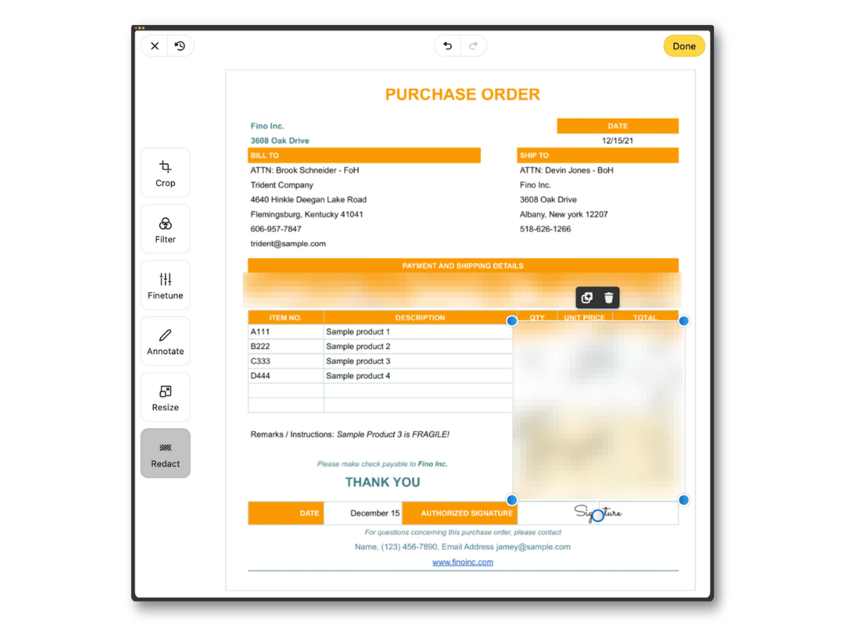
- Redact – remove confidential information or sensitive parts that are visible on the image
Appearance Settings
Editor Appearance
This setting is available in the Appearance section of the Image Hopper field in the Form Editor. It has three options which control how the image editor will be displayed to the user when opened:
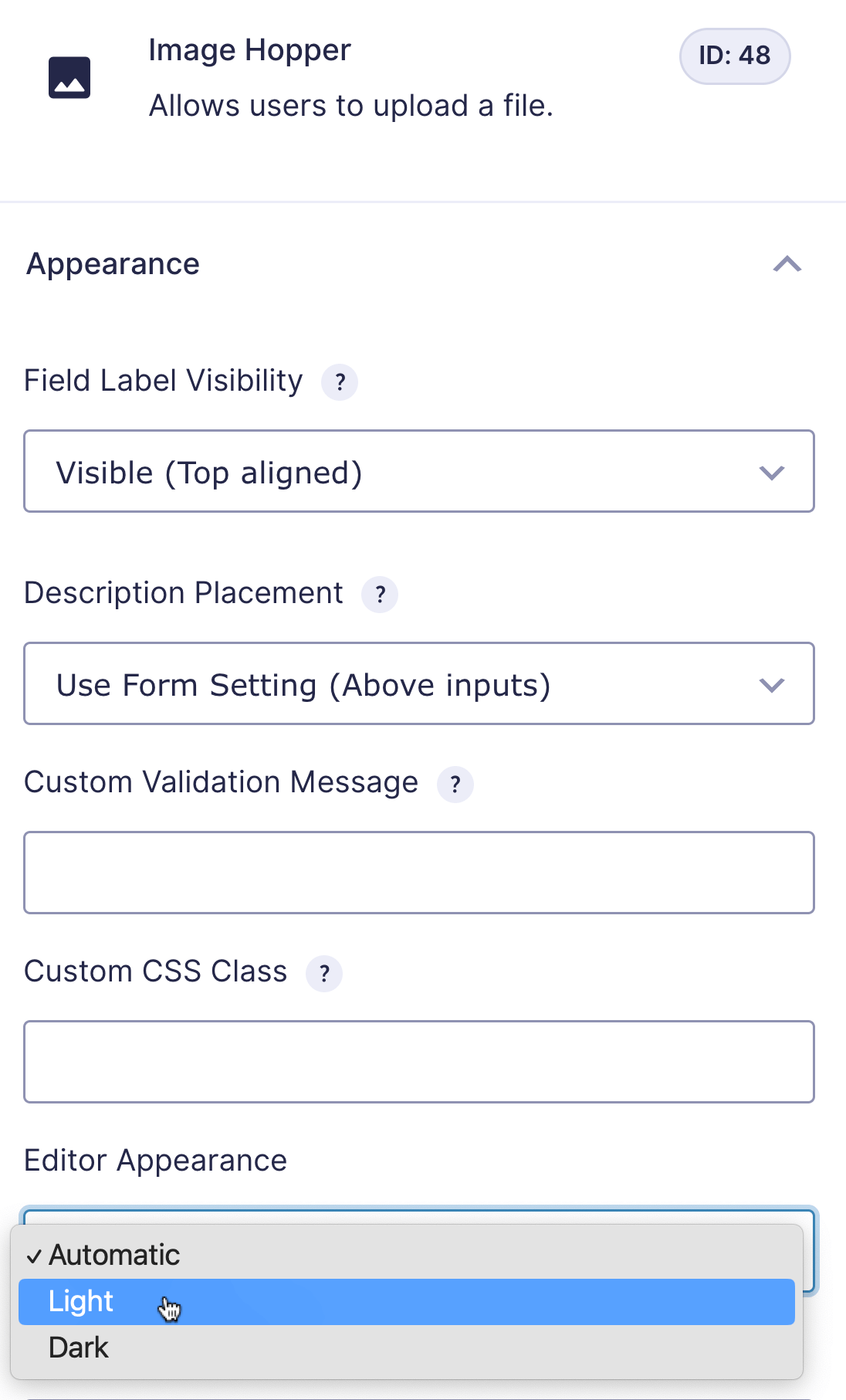
- Automatic – the browser/device settings will determine if the light or dark appearance is shown
- Light – the editor background color will be white and the text black
- Dark – the editor background color will be black and the text white
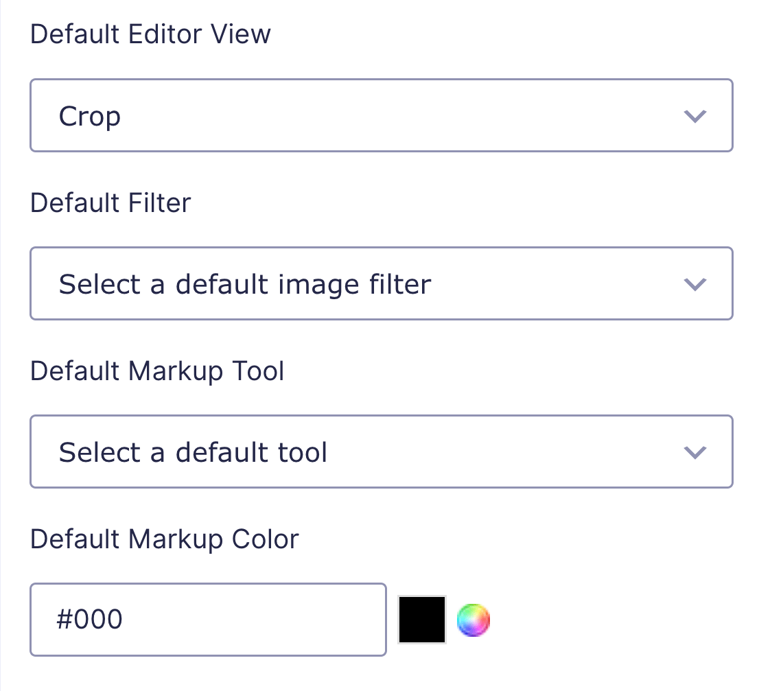
Default Editor View
When the Image Editor is first open, this determines which of the primary setting tabs will be displayed by default: Crop, Filter, Color, Markup, Resize, or Redact. If a primary setting is disabled in Features it will be automatically hidden as an option.
If you use a preset, this setting is automatically adjusted to the relevant option (but you can override it):
- Essentials → Crop
- Color → Filter
- Annotate → Markup
- All → Crop
Default Filter
Automatically apply a filter to the uploaded image. This setting can be used with or without the Image Editor enabled.
Default Markup Tool
Select a markup tool that will automatically be selected when the user clicks on the Annotate tab.
Default Markup Color
Select a color that will automatically be applied to the default markup tool. The default color is black (#000).